Guidance. Influence. Prominence. Success.
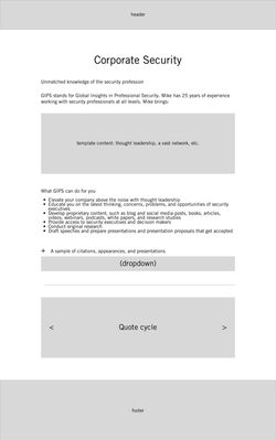
GIPS Insights provides multidisciplinary consultation, content development, and coaching to individuals, businesses, and organizations. Based on the expertise of founder Mike Gips, areas of service include: corporate security, non-profit organizations, research and writing for reports and speeches, and training for media interviews. In addition to general branding, stationery, and business card design, I was tasked with wireframing and visual design of the GIPS Insights website.


Logo Design
The compass rose logo represents the guidance that GIPS Insights offers. The main points of the compass also refer to the four service disciplines. The deep red and blue color scheme also has two different interpretations. Primarily, dark red symbolizes power, leadership, and determination, while dark blue symbolizes wisdom and integrity. At the same time, red is a universal signal of alert in the security sphere (not unlike everyday life), while blue brings about a feeling of safety. For this reason, red is used as more of a highlight while the blue is much more prevalent throughout the brand.
General Brand Guidelines

Consolidated Logo Exploration

Variations